Typography is more than just choosing fonts it shapes how users read, feel, and engage with content. In 2025, good typography is a pillar of digital design, impacting accessibility, readability, and user experience across devices.
One of the best modern examples comes from the UAE Design System, which outlines typography standards that balance clarity, flexibility, and cross-language performance. Here's how these principles can guide your own digital projects.
1) Why Typography Matters in Digital Design
Typography influences how users perceive your brand and navigate your content. It impacts:
- Legibility on all screen sizes
- Visual hierarchy and focus
- Overall user satisfaction and accessibility
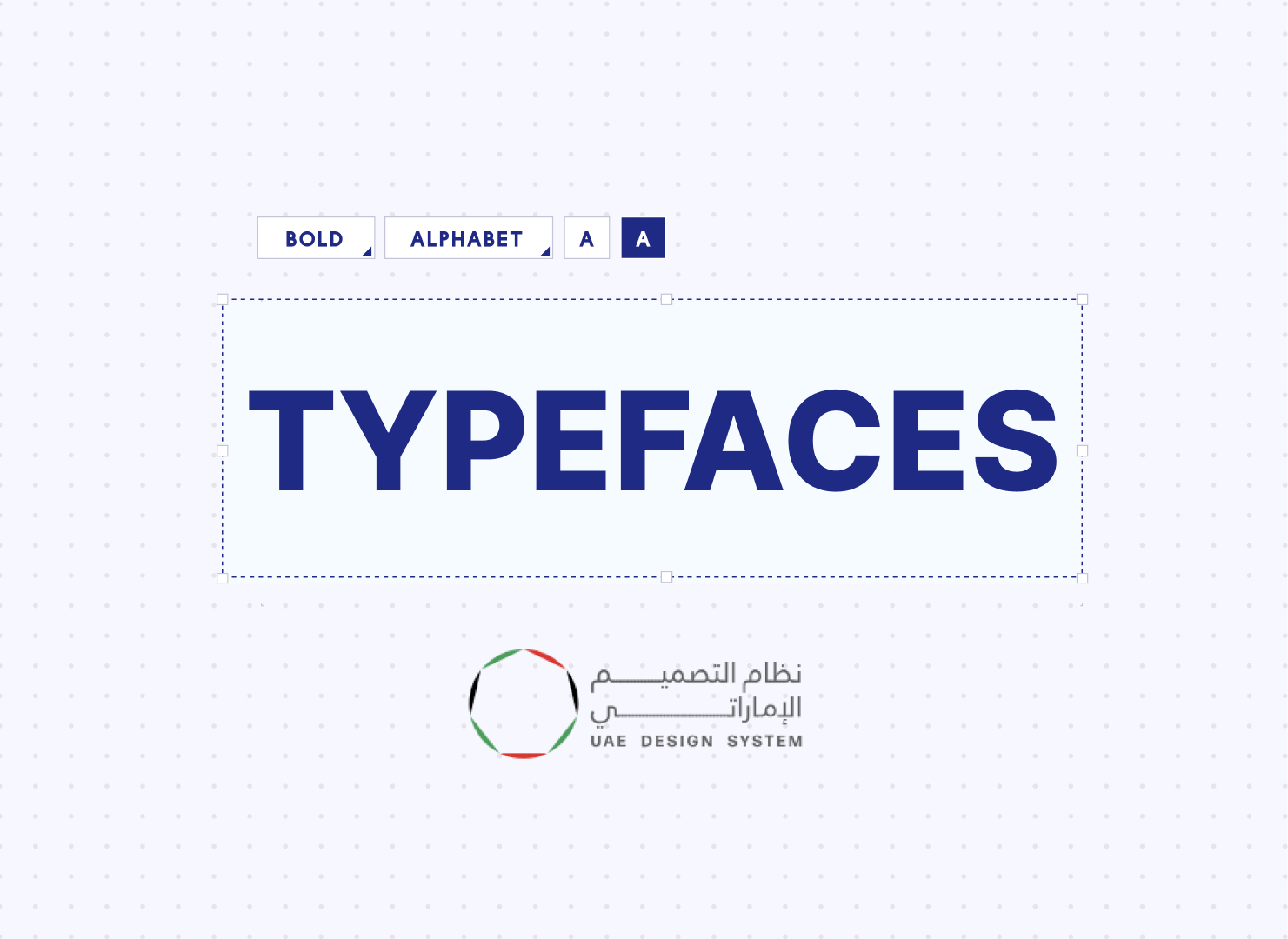
2) Principles from the UAE Design System
The UAE system is built on four guiding principles:
- Personality – Each font conveys a purpose and tone.
- Universality – Typefaces must work across languages and devices.
- Minimalism – Simplicity helps reduce visual clutter.
- Balance – Proportional use of fonts and styles.
3) Fonts Used: English & Arabic
To ensure consistency and performance, Google Fonts are used. These load quickly and adapt to browser settings.
- English: Roboto (5 weights), Inter (4 weights)
- Arabic: Noto Kufi Arabic (5 weights), Alexandria (4 weights)
Roboto is used for body text while Inter is great for headings. Noto Kufi Arabic and Alexandria fulfill the same roles for Arabic content, combining elegance with readability.
4) Font Weights: When and How to Use Them
For clarity and speed, the system limits font weights to five:
font-normal (400) for body textfont-semibold (600) and font-bold (700) for highlightsfont-extrabold (800) for headingsfont-extralight (200) for H1 display titles
5) Responsive Typography Scale
The system uses a Major Third scale, starting at 16px (1rem). Headings grow proportionally:
- H1 Display – 76px
- H1 – 62px
- H2 – 48px
- H3 – 40px
- H4 – 32px
- H5 – 26px
- H6 – 20px
Example for responsive design:
<h1 class="text-h3 lg:text-h2 xl:text-h1 leading-tight">
Visit the UAE's unified digital platform
</h1>
6) Line Height and Paragraph Spacing
According to accessibility standards, body text should have:
- Line-height: At least 1.5x the font size
- Paragraph margin: 2x the font size
- Word spacing: At least 0.16x
- Letter spacing: At least 0.12x
This improves readability for all users, including those with visual or cognitive impairments.
7) Hierarchy and Flow
Typography hierarchy helps guide the reader using:
- Consistent font sizes for headings and paragraphs
- Logical nesting of headings (H1 > H2 > H3)
- Clear emphasis using font weight and spacing
Avoid pairing a large heading next to very small text it breaks the reading flow.
8) Practical Examples from UAE Platforms
The TDRA Virtual Academy and KidX Platform apply these typography standards effectively:
- Readable, responsive text blocks
- Balanced use of headings and body text
- Multi-language font support
Final Thoughts
The UAE Design System offers an excellent model for creating accessible and consistent web typography. Whether you’re building a multilingual government portal or a private sector site, these practices ensure your content looks great and reads well on every screen.
Adopt the same approach to elevate your own digital experiencesmodern typography is about more than fonts. It’s about how your users feel while reading your story.
For more inspiration, explore the full UAE Design System for typography and digital standards.

